If you want to put a logo on clothing, we always ask for a graphic in vector format. Why? This is a special file format that allows you to change its size without worrying about losing quality. If we made such modifications on a bitmap, the final graphics applied to clothing could differ significantly in quality from the original.
What is a vector?
It is an image described using geometrical figures or shapes, enabling any transformation of its size without the risk of losing the initial quality. Most often it appears in the *.CDR format dedicated to Corel Draw or in the *.AI format dedicated to the Adobe package. However, equally popular extensions that can be opened in any graphics programs are *.EPS and *.SVG and the well-known *.PDF format.
In the absence of the required format, we are able to vectorise the file, but relying on the original files is safer.
Logotype colouring or Pantone in practice
Pantone is a colour identification system developed by Pantone Inc. from the USA. This type of colour palette is an indispensable tool for determining the colour of the logotype to be placed on clothing. In the absence of a specific shade provided according to this palette, we try to choose a shade as close as possible to the original.
Logo size and location versus aesthetics
In the case of marking of business clothing, aesthetics is the key to success, which is why we always try to choose the universal size of the logo for the given clothing. How does it look in practice?
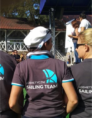
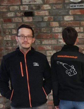
In the case of polo shirts or business shirts, the most commonly chosen place is the left side of the chest –logotypes in this place should have a width of 5 to 8 cm – this guarantees adequate visibility and, at the same time, neatly composes with clothing.
Marking of the collar is also an interesting solution – in this place, the logo will be clearly visible if, for example, a jumper is put on over a shirt.
When it comes to the back, in the case of shirts, this is a rarely used procedure. A shirt, in general, is usually associated with a business, minimalist look, which is why the logo on the back can completely disrupt this concept.
Matching the logo to the clothing
Does your company identify with a specific colour? We will try to choose clothing with a finishing that would nicely match the colours of the logotype, so that the finished product looks as originally produced for your needs.
Conclusion
If you do not have an idea about how to match your logo to the clothing, write to us – we will propose a visualisation of the marking and offer a quote.


